Data Visualization
Contents
Data Visualization
Data visualization is one of the most important steps in a scientific project. You carefully planned your study, you carried out your experiment and collected your data. Now, you embark on the process of understanding and analyzing your data. This process nearly always requires you to see what’s going on with your data. But while a quick-and-dirty plot may be sufficient for you who intimately know the data and its origin, that visualization needs to be refined so that a naive but competent reader can easily understand what you are trying to show them.
In general, any point you want to communicate to your readers should be visualized.
Lucky for us, R is especially suited to generating “publication-ready” plots, though getting your plots to that stage requires a little bit of work.
Tip
If you come across a particularly good (or particularly bad) figure while reading a scientific paper, stop and consider what makes it good (or bad). You may find you want to keep a record for yourself of good visualization tricks you’ve come across.
Below you’ll find a brief introduction to data visualization, as well as many resources and tutorials for visualizing your data effectively and aesthetically.
Getting Started: A Brief Checklist
Data visualization begins with thinking about what type of data you have (e.g. categorical, continuous), and considering what the main aim of the visualization is (e.g. “I want to visualize how levels of my categorical variable sex affect my continuous variable weight.”)
Here’s an example procedure you may follow when starting out on your visualization quest. There’s a set of questions you should ask yourself and, for each of these, actions you should take:
Steps, Part I: Plot
What is the structure of my data? –> View data frame
What message do I want to convey with my data? What graph should I use for which type of data? –> Select a type of graph (See below)
What package(s) or tool(s) do I need to plot my data? –> Select package/function, identify required data format
Which variables do I need? –> Filter data frame
What format should my data be in? –> Wrangle data
Plot data! 🎉🎉
Once you have your preliminary plot, it’s time to turn your attention to the finer details to make sure your plot is intelligible to others (and to yourself in the future).
Here’s a (non-comprehensive) list of questions and actions you should take:
Steps, Part II: Refine
Are the units of my variables appropriate? –> Modify data frame by transforming units (e.g. miliseconds to seconds)
Are the axes limits appropriate (espcially with multiple plots)? –> Define axes limits
Are my axes ticks, axes labels, legend labels, title, subtitle, and/or captions complete and appropriate? –> Modify plot components
Is my color scheme consistent across plots, appealing, and color-blind friendly? –> Select and apply a color palette (See below)
As you can see, data visualization requires some amount of data wrangling first. For this reason, you will see many tutorials begin by manipulating the data into the right format for the plotting function in question.
Comprehensive Tutorials & Worked Examples in R
There are many tutorials with worked examples in R that can guide you through the steps outlined above. Just a few of them are:
R for Data Science (Ed: O’Reilly) by the R4DS Team (2017-01)
R Graphics Cookbook (Ed: O’Reilly) by Winston Chang (2022-01-14)
Data Visualization with R by Rob Kabacoff (2020-12-01)
Example Data
Many tutorials will provide examples using built-in datasets that either come in base R or in frequently-used packages, such as tidyverse.
The most commonly-used are mtcars and iris.
Tip
If you’re stuck on a plotting issue and want to get help from the scientific community, Stack Overflow is a great forum.
Your question will have a greater chance of getting answered if you post a reproducible example using one an in-built dataset such as mtcars or iris.
Choosing the right graph
In Step 2., once you have decided what message you want to convey with your data, you must answer the question: What graph should I use for which type of data?
Even for seasoned plotters, it’s useful to reference a visualization cheat sheet such as R Graph Gallery or the Visual Vocabulary guide from the Financial Times.
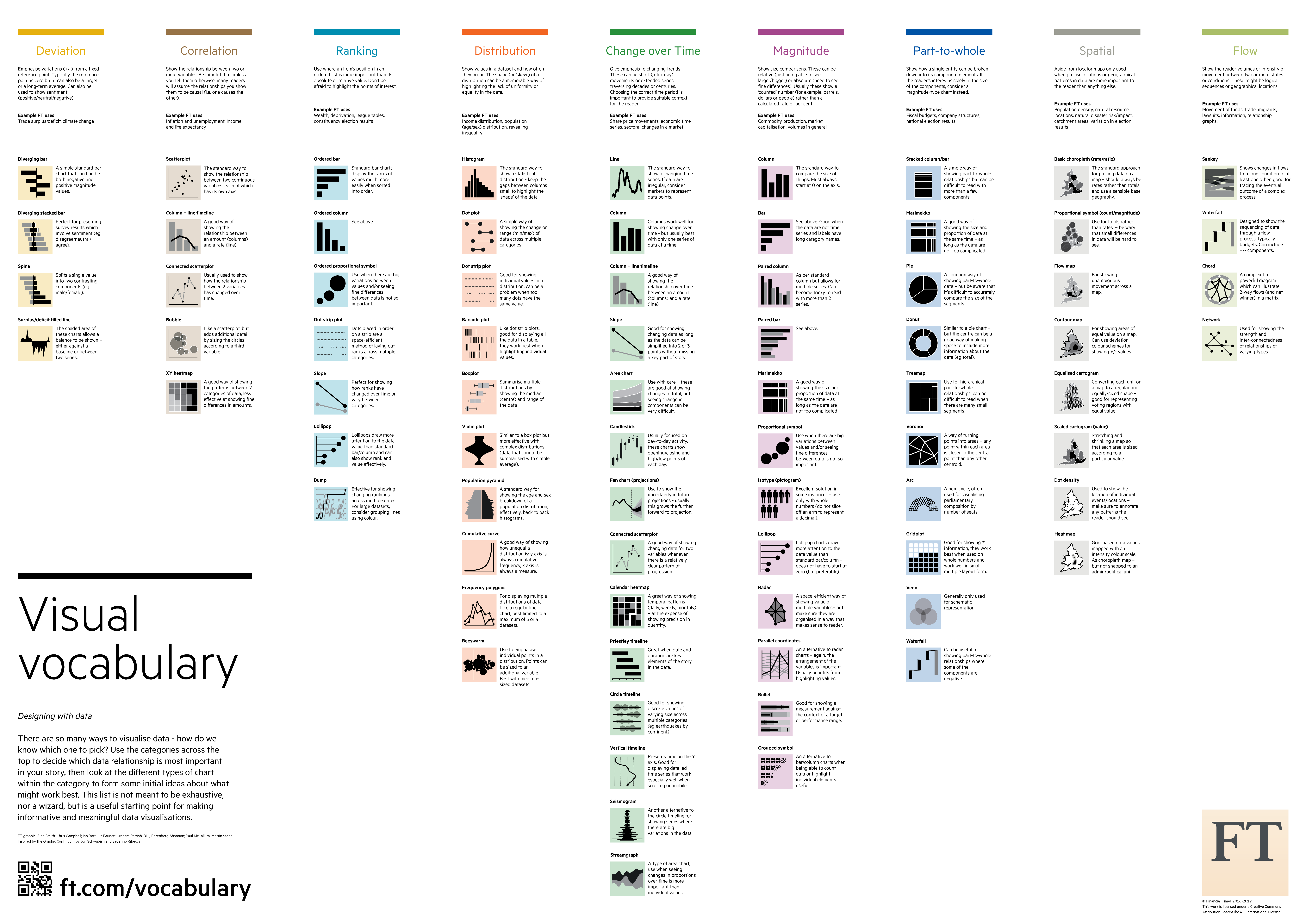
Both of these resources (and many others) can give you some inspiration for how to plot whatever data you have.
The R Graph Gallery additionally features tutorials in R for visualizing each type of graph, mainly using ggplot2.
Choosing a color palette
Your choice of color palette may seem like a merely ornamental part of plotting, but is a crucial element of your plot. Check out this article on the misuse of color in science communication, published in Nature.
A poor color palette may confuse readers because the colors are too similar.
Similarly, some commonly-used colormaps that are used to visualize continuous change in some variable (e.g. temperature) in fact distort the data they aim to represent.
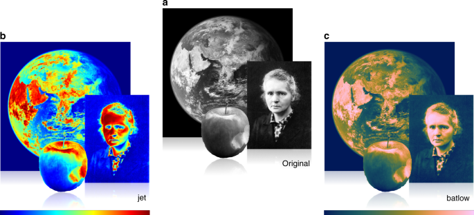
Fig. 1 Marie Skłodowska-Curie, as originally photographed by Henri Manuel around 1920, the Earth from space, and an apple are shown a) in their original images and b) in distorted [the commonly-used “jet” palette] and c) in undistorted colour versions. Inferring the true picture from an unscientifically (e.g., jet) coloured data set is incomparably harder than from a data set represented in a perceptually uniform and ordered colour map, like batlow. From Nature Communications.
In addition, your plots are likely to be seen by color-blind individuals (an estimated 8% of men have some form of color-blindness).
Luckily, many visualization tools feature palettes that compensate for quirks in human color perception, are aesthetic, and color-blind-friendly.
Packages with read-made palettes:
RColorBrewer: particularly suited for categorial data
viridis: particularly suited for continuous data & color-blind friendly
ggsci: palettes modelled after scientific journal themes
Tools for creating your own palettes:
How to pick more beautiful colors for your data visualizations from Datawrapper
Adobe Color Wheel (with Color-Blind feature)
A list of all colors available in base R can be found here.
Advanced Tools
Once you’ve got a handle on the basics, you can look forward to the many great tools that await you! You can combine plots, make plots interactive or 3D, animate your plots, and more:
Guide to Interactive web-based data visualization by Carson Sievert (2019-12-19)
Guide to plot layouts in the g-universe by Baptiste Auguié (2019-07-13)
Guide to animating plots from R Graph Gallery